15 Modern Color Palette Ideas for Every Room

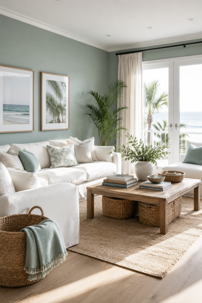
Modern color palettes can completely transform the way a room feels, even without requiring expensive renovations. The right combination of shades can make a compact space appear brighter, create warmth in an open room, or introduce personality into a plain interior. From earthy greens and soft blues to dramatic charcoal and warm terracotta, these carefully selected palettes offer stylish inspiration for bedrooms, kitchens, living rooms, bathrooms, dining areas, and home offices.

Choosing a cohesive color palette also makes decorating easier because it gives every furniture piece, textile, and accessory a clear visual direction. A successful scheme usually combines one dominant color, one supporting shade, and several subtle accents. These modern palette ideas are designed to suit different moods and interior styles, helping you create spaces that feel balanced, inviting, and effortlessly Pinterest-worthy throughout every room in your home.


1. Warm White, Beige, and Natural Oak
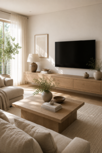
Warm white, beige, and natural oak create a timeless palette that makes almost any room feel bright, calm, and welcoming. Warm white provides a clean foundation without appearing as harsh as pure white, while beige introduces softness through upholstery, curtains, and rugs. Natural oak adds organic warmth and visible texture. Together, these shades work beautifully in living rooms, bedrooms, entryways, and open-plan spaces where a peaceful and cohesive atmosphere is desired.

To keep this neutral palette from appearing flat, layer different materials and slightly varied tones. Combine linen, boucle, woven baskets, pale timber, and handmade ceramics to create depth. Small accents of black, bronze, or muted greenery can provide definition without disrupting the soothing appearance. This palette is especially effective in rooms with plenty of natural light, where subtle shadows and textures help every neutral element feel more sophisticated and intentionally selected.

2. Sage Green, Cream, and Walnut
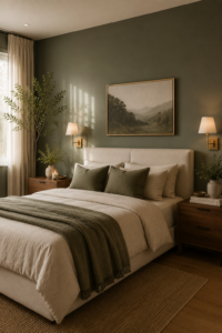
Sage green, cream, and walnut form a calming nature-inspired combination that feels modern without becoming overly trendy. Sage green brings a soft botanical quality to walls or cabinetry, while cream keeps the room light and comfortable. Rich walnut provides contrast and grounds the gentler colors with its deep brown tone. This palette works particularly well in bedrooms, living rooms, home offices, and kitchens where relaxation and natural warmth are important.

Use sage as the main wall color or introduce it through curtains, bedding, or painted furniture when you prefer a subtler change. Cream upholstery and textiles will soften the look, while walnut tables, shelves, or cabinets provide structure. Brass lighting and terracotta accessories can add warmth, but they should be used sparingly. Finish the room with real or artificial greenery to strengthen the organic character and create a beautifully coordinated Pinterest-inspired interior.

3. Navy Blue, Crisp White, and Brass
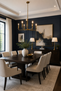
Navy blue, crisp white, and brass create a sophisticated palette that feels both classic and contemporary. Navy adds depth and drama, while white prevents the room from becoming too dark or visually heavy. Brass introduces a warm metallic finish that reflects light and gives the entire scheme a polished appearance. This combination is ideal for dining rooms, bathrooms, home offices, and bedrooms where you want a strong visual statement with enduring elegance.

Paint one feature wall navy or use the color across cabinetry for a bold but controlled effect. Balance it with white ceilings, molding, countertops, or bedding to maintain freshness. Brass can appear through pendant lights, mirrors, handles, or decorative objects. Incorporating natural wood and soft neutral fabrics will make the palette feel more comfortable. The finished space will look refined and luxurious without requiring excessive decoration or complicated patterns.
4. Terracotta, Sand, and Soft Olive

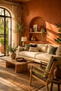
Terracotta, sand, and soft olive bring warmth and natural character into a room through colors inspired by clay, earth, and foliage. Terracotta creates an inviting focal point, while sandy neutrals provide a relaxed background. Olive green introduces balance and prevents the warm colors from feeling overly orange. This palette is particularly suitable for living rooms, dining rooms, sunrooms, and bedrooms designed with Mediterranean, bohemian, or modern organic influences.

Use terracotta on an accent wall, upholstered chair, or decorative ceramics rather than covering every surface. Sand-colored furniture and curtains can provide the dominant neutral foundation, while olive appears through cushions, artwork, and greenery. Woven materials, light wood, and linen will enhance the palette’s natural quality. Warm lighting is especially important because it highlights the earthy undertones and creates a comfortable, sun-washed atmosphere throughout the room.


5. Charcoal, Greige, and Warm Wood

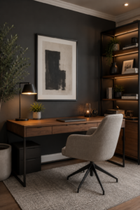
Charcoal, greige, and warm wood offer a modern palette that feels dramatic, grounded, and highly practical. Charcoal provides strong contrast, while greige combines the softness of beige with the contemporary appearance of gray. Warm timber prevents the scheme from becoming cold or industrial. This combination works especially well in home offices, living rooms, media rooms, and masculine bedrooms where a structured yet comfortable atmosphere is preferred.

Apply charcoal to one wall, built-in shelving, or cabinetry, then use greige on larger upholstered pieces and surrounding walls. Introduce walnut, oak, or teak through desks, consoles, and side tables to add visible warmth. Black metal lighting can reinforce the contemporary appearance, while cream textiles provide additional softness. Carefully layered lighting will prevent dark surfaces from absorbing too much brightness and help the room remain welcoming throughout the day.


6. Dusty Blue, Blush Pink, and Ivory

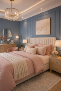
Dusty blue, blush pink, and ivory create a graceful color palette that feels soft, modern, and balanced. Dusty blue brings calmness and subtle depth, while blush introduces warmth without becoming overly bright or feminine. Ivory acts as a gentle neutral that connects both colors. This palette is perfect for bedrooms, nurseries, reading corners, and dressing rooms where a restful atmosphere and delicate visual interest are equally important.

Choose dusty blue for walls or curtains, then introduce blush through bedding, cushions, artwork, or a small accent chair. Ivory furniture and rugs will keep the room feeling light and spacious. Pale wood, brushed gold, and clear glass accessories can add elegance without overwhelming the gentle palette. Use fabrics with different textures, including velvet, linen, and cotton, to create depth while maintaining the scheme’s peaceful and sophisticated character.


7. Forest Green, Black, and Camel

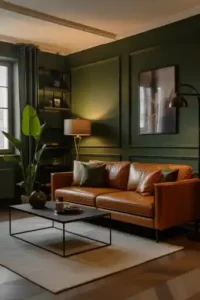
Forest green, black, and camel produce a rich and confident palette with a luxurious modern character. Forest green creates depth and connects the room with nature, while black adds sharp definition through furniture and fixtures. Camel leather introduces warmth and prevents the darker tones from appearing severe. This combination is particularly effective in living rooms, libraries, home offices, and dining spaces with abundant light and strong architectural features.

Use forest green across one or more walls, then introduce black through shelving, window frames, lighting, or tables. A camel leather sofa or chair will become a warm central feature that ages beautifully over time. Cream rugs and curtains can brighten the palette, while brass or bronze accessories introduce subtle shine. Keep decorative items limited so the strong colors and quality materials remain the primary focus of the room.


8. Lavender Gray, White, and Silver

Lavender gray, white, and silver create a cool, peaceful palette that feels more interesting than traditional gray while remaining easy to decorate. Lavender gray has a delicate purple undertone that changes beautifully under different lighting conditions. White provides clarity and brightness, while silver introduces a refined reflective element. This combination works wonderfully in bedrooms, bathrooms, dressing rooms, and quiet reading spaces where a fresh and soothing atmosphere is desired.

Use lavender gray on walls and repeat it subtly through cushions, curtains, or artwork. White bedding, cabinetry, and trim will keep the room crisp, while silver can appear through mirrors, lamps, handles, and decorative trays. Avoid excessive metallic accessories because a few carefully positioned pieces will create a more polished result. Soft fabrics and diffused lighting will enhance the dreamy quality and prevent the cooler palette from feeling clinical.


9. Mustard Yellow, Teal, and Cream

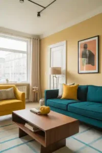
Mustard yellow, teal, and cream create an energetic palette that adds personality while remaining sophisticated. Teal offers rich blue-green depth, mustard introduces warmth and optimism, and cream provides a quiet background that allows both colors to stand out. This combination is ideal for living rooms, dining areas, creative offices, and children’s spaces where you want a cheerful atmosphere without relying on overly bright primary colors.

Use cream as the dominant wall color, then introduce teal through a sofa, cabinet, or statement rug. Mustard works best as a smaller accent on chairs, cushions, throws, or artwork. Walnut furniture can connect the warm and cool tones, while black details provide definition. Repeating each accent color in two or three places will make the room feel coordinated rather than random, resulting in a vibrant and memorable interior.


10. Clay Pink, Burgundy, and Warm Taupe

Clay pink, burgundy, and warm taupe create a layered palette that feels romantic, mature, and deeply inviting. Clay pink offers earthy warmth, burgundy introduces richness, and taupe provides a practical neutral foundation. Unlike brighter pink combinations, this scheme has muted undertones that make it suitable for sophisticated bedrooms, lounges, dining rooms, and dressing spaces. It feels especially beautiful during autumn and winter but can remain stylish throughout every season.

Apply clay pink to the walls or use it through curtains and upholstery, then add burgundy in smaller, more concentrated areas. A velvet headboard, armchair, or patterned rug can provide the necessary depth. Warm taupe bedding and furniture will balance the stronger shades. Dark wood, antique brass, and soft lighting complement this palette particularly well, creating an intimate room that feels luxurious without becoming excessively formal or decorative.


11. Powder Blue, Light Gray, and Pale Oak

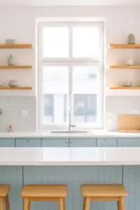
Powder blue, light gray, and pale oak create an airy palette that feels clean, fresh, and quietly contemporary. Powder blue introduces gentle color without overwhelming the room, while light gray provides a modern neutral backdrop. Pale oak adds warmth and natural texture, keeping the cooler shades from feeling sterile. This combination suits kitchens, bathrooms, bedrooms, and small apartments where brightness and visual spaciousness are key design priorities.

Use powder blue on cabinets, a feature wall, or selected textiles, then support it with light gray flooring, tiles, or upholstery. Pale oak shelving, stools, and furniture will connect the palette to nature. White countertops and ceilings can increase brightness, while matte black handles add small areas of contrast. Keep accessories simple and functional to preserve the uncluttered Scandinavian quality that makes this color combination feel peaceful and effortlessly modern.


12. Chocolate Brown, Cream, and Burnt Orange

Chocolate brown, cream, and burnt orange form a warm and comforting palette with subtle retro influence. Chocolate brown grounds the room and creates a cocooning effect, while cream prevents the darker shade from feeling overwhelming. Burnt orange brings energy and highlights the brown undertones. This palette works beautifully in living rooms, bedrooms, dining rooms, and reading corners where warmth, comfort, and a sense of intimacy are desired.

Choose chocolate brown for a feature wall, sofa, or built-in cabinet, then balance it with generous areas of cream. Burnt orange can appear through cushions, artwork, throws, or one statement chair. Dark timber, woven fabrics, and amber glass will reinforce the palette’s cozy character. Add several sources of warm light instead of one bright fixture to highlight the rich colors and create a welcoming atmosphere during the evening.


13. Black, White, and Emerald Green

Black, white, and emerald green create a bold, graphic palette that feels modern and luxurious. Black introduces strength and definition, white provides a clean contrast, and emerald green adds a jewel-toned focal point. This combination is ideal for dining rooms, powder rooms, bedrooms, and contemporary living spaces where a confident visual statement is desired. It works particularly well with clean furniture shapes and carefully selected decorative elements.

Use black across one wall, cabinetry, or architectural details, while keeping ceilings and larger furniture pieces white to maintain balance. Emerald green can appear through velvet seating, curtains, tiles, or artwork. Brass and gold details enhance the jewel-like quality, while light wood can soften the contrast. Avoid adding numerous competing colors because the strength of this palette comes from its controlled, high-impact combination and clear visual structure.


14. Peach, Mint Green, and Soft White

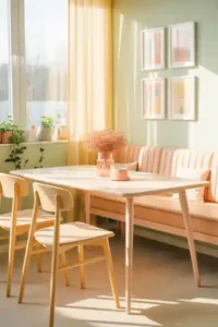
Peach, mint green, and soft white create a fresh pastel palette that feels cheerful, youthful, and inviting. Peach introduces gentle warmth, mint adds a refreshing botanical quality, and soft white keeps the scheme bright and balanced. This combination is ideal for kitchens, breakfast areas, nurseries, bathrooms, and creative spaces. Unlike highly saturated colors, these muted pastels can cover larger surfaces without making a room feel visually busy.

Use mint green for walls or cabinetry and introduce peach through seating, tiles, cushions, or decorative artwork. Soft white should appear on ceilings, trim, and larger furniture pieces to provide visual breathing room. Light wood and woven accessories will add warmth, while small brass details can create refinement. Plenty of daylight will help the colors look clean and uplifting, producing a playful interior that still feels coordinated and modern.


15. Deep Plum, Mushroom Beige, and Bronze

Deep plum, mushroom beige, and bronze form a sophisticated palette that feels luxurious, dramatic, and unexpectedly versatile. Plum introduces rich color without the sharpness of bright purple, while mushroom beige provides a warm neutral balance. Bronze adds depth and subtle metallic shine. This combination works exceptionally well in bedrooms, dining rooms, lounges, and formal home offices where a cozy but elegant mood is preferred.

Use deep plum on one feature wall or through velvet upholstery, then surround it with mushroom-colored furniture, rugs, and curtains. Bronze lighting, mirrors, and handles will highlight the warm undertones of both colors. Dark wood can make the palette feel more traditional, while pale oak creates a modern contrast. Soft ambient lighting is essential because it brings out the richness of the plum and prevents the room from appearing overly dark.

Similar Posts

Leave a Reply

Your email address will not be published. Required fields are marked *