17 Paint Color Trends That Will Transform Your Home in 2026
Choosing the right paint color has always been one of the easiest and most affordable ways to completely change the look and feel of a home. As we move into 2026, homeowners are embracing colors that create warmth, comfort, personality, and timeless beauty instead of following short-lived fads.
Today’s paint trends focus on creating spaces that feel inviting, relaxing, and connected to nature while still offering enough flexibility to suit modern lifestyles. Whether you’re refreshing a single room or planning a whole-home makeover, the right shade can dramatically improve your home’s atmosphere.
This year’s trending paint colors combine earthy neutrals, sophisticated blues, cozy greens, warm whites, and bold statement hues that work beautifully in every design style—from modern minimalist and Scandinavian to farmhouse, traditional, and luxury contemporary interiors. Many of these colors pair effortlessly with natural wood, stone, brass fixtures, textured fabrics, and sustainable décor, making them perfect for today’s homes.
1. Warm Greige

Warm greige continues to dominate interior design because it blends the comfort of beige with the elegance of gray. The result is a versatile backdrop that works with nearly every decorating style, allowing furniture, artwork, and architectural details to stand out naturally.Unlike cooler grays that once dominated homes, warm greige creates a softer and more welcoming atmosphere throughout every room.
This timeless shade works beautifully in living rooms, bedrooms, hallways, and open-concept spaces where continuity matters. Pair it with natural oak furniture, woven textures, soft white trim, and black accents for a balanced look. Warm greige also adapts well to changing décor, making future design updates simple without requiring another complete repaint.
2. Olive Green
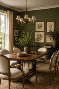
Olive green brings nature indoors while adding richness and sophistication to everyday living spaces. This earthy color creates a calming environment without feeling overly dark, making it ideal for homeowners who want more personality than neutral paint offersIts muted tone pairs beautifully with wood finishes, leather furniture, and natural stone elements.
Many designers recommend olive green for dining rooms, home offices, or accent walls where warmth encourages relaxation and conversation. Complement the color with cream textiles, matte black fixtures, and plenty of greenery to create an organic, designer-inspired look that feels current well beyond 2026.
3. Soft Terracotta
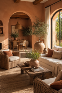
Soft terracotta introduces warmth inspired by Mediterranean landscapes and handcrafted clay finishes. Unlike bright orange tones, modern terracotta feels subtle, grounded, and inviting.
It instantly adds character to spaces while maintaining enough softness to remain comfortable for everyday living.
This paint color shines in living rooms, kitchens, and entryways where earthy warmth welcomes guests. Pair it with whitewashed wood, textured fabrics, ceramic accessories, and warm lighting for an effortlessly cozy home that celebrates natural materials and timeless design influences.
4. Deep Navy Blue
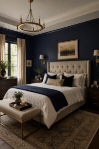
Deep navy blue remains one of the most elegant paint choices for homeowners seeking bold sophistication without overwhelming a room. Its rich depth creates dramatic contrast while remaining surprisingly versatile. Navy works equally well in traditional homes and sleek contemporary interiors.
Bedrooms, libraries, offices, and dining rooms benefit especially from this luxurious hue. Pair navy walls with crisp white trim, brass fixtures, velvet textiles, and light-colored furniture to create visual balance while maintaining an upscale atmosphere that feels timeless.
5. Creamy White
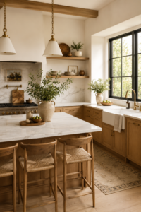
Creamy white replaces stark bright white by introducing subtle warmth that feels inviting rather than clinical. This gentle neutral reflects natural light beautifully while providing the perfect backdrop for both colorful décor and minimalist styling.
It works exceptionally well throughout entire homes because it creates visual continuity while allowing architectural details to shine. Add layered textures through wood, linen, stone, and woven baskets to prevent the room from feeling flat or overly simple.
6. Sage Green
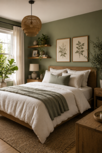
Sage green continues gaining popularity thanks to its soothing, nature-inspired appearance. It promotes relaxation while remaining sophisticated enough for modern homes. Unlike brighter greens, sage feels muted, balanced, and highly adaptable.
Use sage in bedrooms, bathrooms, or home offices where calmness is essential. Pair it with natural wood, cream fabrics, matte black accents, and abundant daylight to create a refreshing retreat that encourages rest and productivity.
7. Dusty Blue
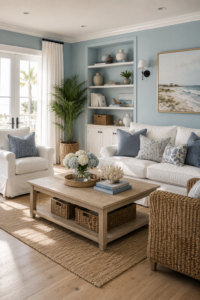
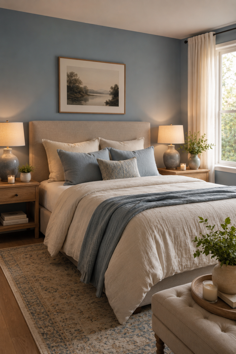
Dusty blue combines tranquility with understated elegance, making it ideal for homeowners seeking subtle color without overwhelming their interiors. Its muted appearance complements both classic and modern furnishings.
This versatile shade looks beautiful in bedrooms, bathrooms, and living rooms where peaceful environments are desired. Combine it with white trim, light woods, soft gray textiles, and brushed nickel finishes for a fresh yet timeless aesthetic.
8. Chocolate Brown
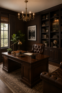
Chocolate brown is making a strong comeback as homeowners embrace richer, cocoon-like interiors. The deep tone adds warmth, sophistication, and a sense of comfort that lighter neutrals cannot achieve.
Use it in libraries, offices, or media rooms alongside cream furniture, walnut wood, brass accessories, and layered lighting. The result feels luxurious, intimate, and perfectly suited for relaxing evenings.
9. Muted Blush
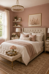
Muted blush offers subtle warmth without appearing overly pink or youthful. Modern blush tones function almost like neutrals, adding softness that flatters both natural and artificial lighting.
Perfect for bedrooms, nurseries, and reading spaces, muted blush pairs beautifully with warm woods, ivory textiles, brass fixtures, and marble accents to create refined, welcoming interiors.
10. Charcoal Gray
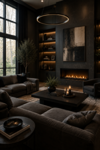
Charcoal gray creates dramatic elegance while remaining more approachable than pure black. It adds depth and highlights architectural features, artwork, and statement furniture with remarkable sophistication.
Balance charcoal walls using lighter furniture, oversized mirrors, natural wood flooring, and layered lighting. This combination prevents rooms from feeling dark while preserving their luxurious appearance.
11. Butter Yellow
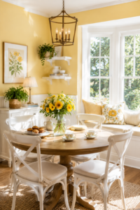
Butter yellow introduces cheerful warmth without overwhelming a room. Its soft golden tone brightens interiors while maintaining an elegant appearance that feels fresh rather than dated.
Ideal for kitchens, breakfast areas, and family rooms, butter yellow pairs wonderfully with white cabinetry, natural wood, woven textures, and fresh greenery to create uplifting everyday spaces.
12. Forest Green
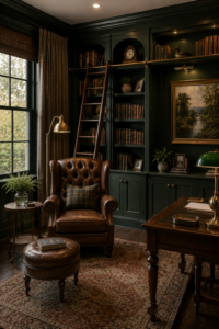
Forest green delivers bold elegance inspired by lush landscapes. The deep shade creates a luxurious backdrop that enhances wood furniture and vintage-inspired décor while maintaining timeless appeal.
This rich color works beautifully in offices, libraries, dining rooms, and feature walls. Pair it with brass, walnut wood, cream upholstery, and classic artwork for maximum sophistication.
13. Warm Taupe
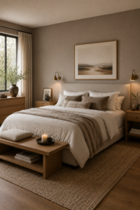
Warm taupe bridges beige and brown, creating a refined neutral that feels comforting and contemporary. It provides more depth than standard beige while remaining highly versatile across decorating styles.
Use taupe throughout open-concept homes for seamless transitions between rooms. Layer different textures like linen, boucle, wool, and natural wood to enhance visual interest without relying on bold colors.
14. Misty Lavender
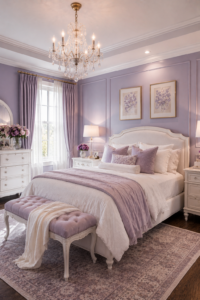
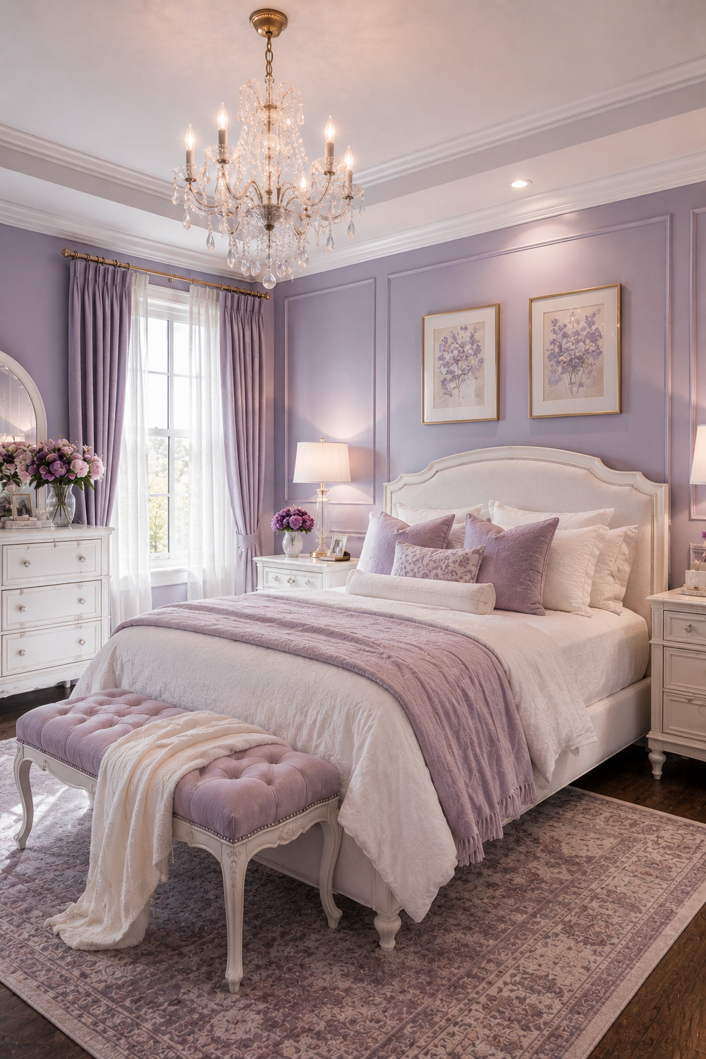
Misty lavender introduces gentle color while preserving a sophisticated atmosphere. The muted tone reflects light beautifully and creates peaceful environments ideal for relaxation and quiet moments.
Bedrooms, reading nooks, and guest rooms particularly benefit from this calming shade. Pair it with soft gray, ivory, silver accents, and plush textiles for a serene retreat.
15. Smoky Teal
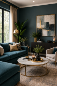
Smoky teal blends blue and green into a sophisticated statement color that feels both modern and timeless. It offers depth while remaining softer than jewel tones.
This color performs exceptionally well on accent walls, built-in shelving, and dining rooms. Combine it with brass lighting, walnut furniture, and neutral upholstery for an elegant designer finish.
16. Sand Beige
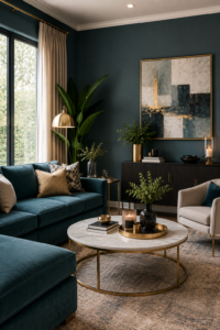
Sand beige reflects the growing preference for warm minimalist interiors inspired by beaches and natural landscapes. Its soft tone creates inviting spaces that feel bright without becoming stark.
Pair sand beige with linen curtains, woven baskets, pale wood furniture, and creamy textiles to achieve a relaxed atmosphere that works beautifully year-round.
17. Rich Black Accent Walls
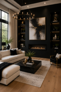
Rich black accent walls continue evolving into one of the boldest design trends for 2026. Used strategically, black creates dramatic contrast that highlights furniture, fireplaces, shelving, and artwork while adding architectural depth to otherwise simple rooms.
Balance black walls with abundant natural light, warm wood finishes, textured fabrics, oversized mirrors, and white or cream furnishings. This thoughtful combination prevents heaviness while delivering an unforgettable, magazine-worthy interior that feels sophisticated and contemporary.
Conclusion
The biggest paint color trends of 2026 embrace warmth, personality, and timeless elegance instead of fleeting design fads. Whether you’re drawn to calming sage green, luxurious navy blue, earthy terracotta, or sophisticated charcoal gray, each color offers a unique opportunity to refresh your home and reflect your personal style. By combining these trending shades with natural textures, quality lighting, and thoughtful décor, you can create beautiful living spaces that remain stylish for many years to come.